My blog, the 2017 edition
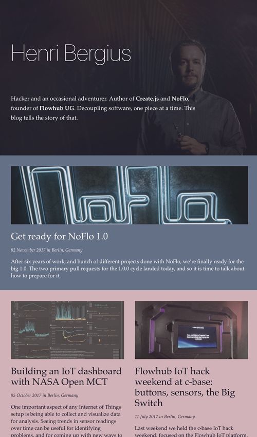
I guess every five years is a good cadence for blog redesigns. This year’s edition started as a rewrite of the technical implementation, but I ended up also updating the visuals. Here I’ll go through the design goals, and how I met them.
More robust and secure delivery
This year the web has been strongly turning towards encryption. While my site doesn’t contain any interactive elements, using HTTPS still makes it harder for malicious parties to track and modify the contents people read.
For the past five years, my blog has been hosted on GitHub Pages. While otherwise that has been a pretty robust solution, they sadly don’t support SSL for custom domains. A common workaround would be to utilize Cloudflare as a HTTPS proxy, but that only works if you let them manage your domain. Since bergie.iki.fi is a subdomain, that was off the cards.
Instead, what I did was turn towards Amazon Web Services. I used Amazon Certificate Manager with my iki subdomain to get an SSL certificate, and utilized Travis CI to build the Jekyll site and upload to S3.
From there the site updates are served using Amazon CloudFront CDN, routed using Route53.
With this, I only need to push new changes to this site’s GitHub repository, and robots will take care of the rest, from producing the HTML pages to distributing them via a global content delivery network.
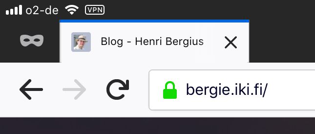
And, I get the friendly green lock icon.
Easier image rescaling
I moved the site from Midgard CMS to the Jekyll static site generator in 2012. At that point, images were stored in the same GitHub repository alongside the textual contents.
However, the sheer volume of pictures accumulated on this site over the years made the repository quite unwieldy, and so I moved them to Amazon S3 couple of years ago.
This made working with different sizes of images a bit more unwieldy, as I’d have to produce the different variants locally and upload them separately.
Now, with the new redesign I built an Amazon Lambda function to resize images on-demand. My solution is implemented in NoFlo, roughly following the ideas from this tutorial but utilizing the excellent noflo-sharp library.
This is a topic I should write about in more detail, but it turns out NoFlo works really well with Amazon Lambda. You can use any Node.js NoFlo graph there by simply wrapping it using the asCallback embedding API.
The end result is that I only need to upload original size images to S3 using some tool (NoFlo, s3cmd, AWS console, or the nice DropShare app), and I can get different sizes by tweaking the URL.
I could have gone with ImgFlo, but right now I need only rescaling, and running the whole GIMP engine felt like an overkill.
New visuals
After the technical side of the blog revamp was done, I turned towards the design aspects. I wanted more color, and also to benefit from the features of the modern web. This meant that performance-hindering things like Bootstrap, jQuery, and Google Fonts were out, since nowadays you can do pretty nice sites with pure CSS alone.
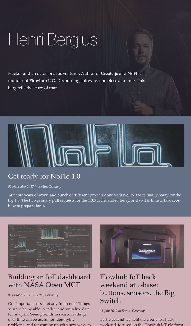
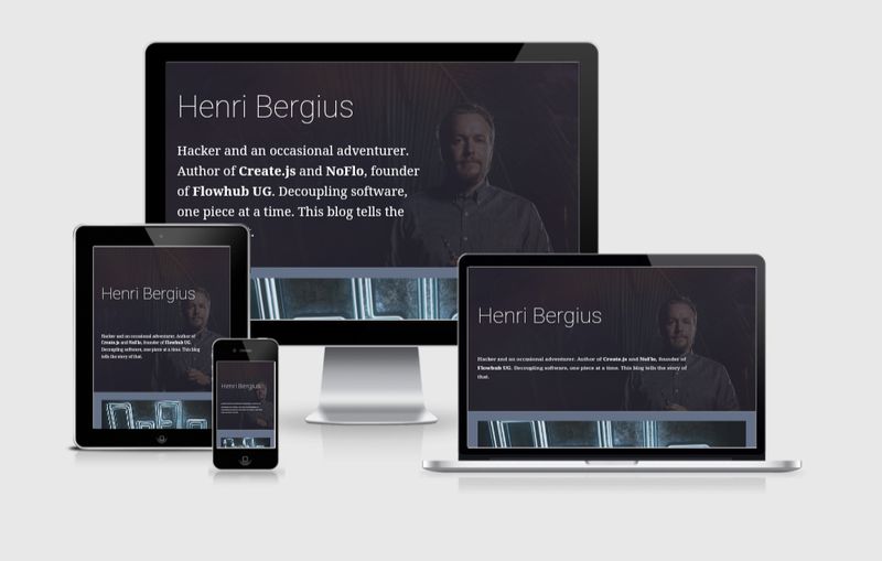
In addition to the better CDN setup, the redesign improved the site’s PageSpeed score. And I think it looks pretty good.
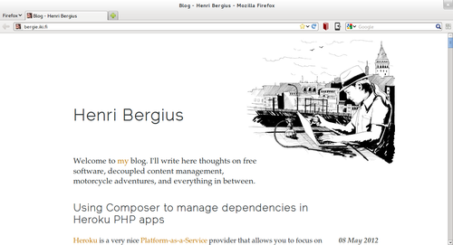
Here’s the front page:
For reference, here is how the 2012 edition looked like:

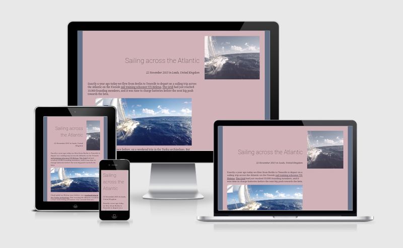
I also spent a bit of time to make sure the site looks nice on both smartphones and tablets, since those are the devices most people use to browse the web these days.
Here is how the site looks like on different devices, courtesy of Am I Responsive
Better content discoverability
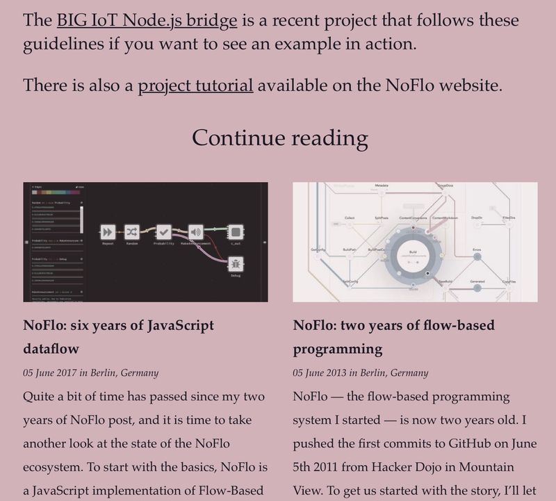
This site has over 1000 articles, and it is easy to lost in those volumes. To make it easier to discover content, I implemented a related posts feature.
I originally wanted to use Jekyll’s Latent Semantic Indexing feature, but with this amount of content that simply blows up.
Instead, I ended up building my own hacky implementation based on categorization and similar keywords in posts using Liquid templates. This makes full site builds a bit slow, but the results seem quite good:
Staying up to date
While most people probably discover content now via Twitter or Facebook (both of which I occasionally share my things in, in addition to places like Reddit or Hacker News as needed), RSS is still the underpinning of receiving blog updates.
For this, the site is available as both:
Feel free to add one of them to the news aggregator of your choice!
I also supply /now page for current activities, inspired by the NowNowNow movement. Here is how Derek Sivers described the idea:
People often ask me what I’m doing now.
Each time I would type out a reply, describing where I’m at, what I’m focused on, and what I’m not.
So earlier this year I added a /now page to my site: https://sivers.org/now
A simple link. Easy to remember. Easy to type.
It’s a nice reminder for myself, when I’m feeling unfocused. A public declaration of priorities.
Previous redesigns
I’ve been running this site since 1997. Here is what I’ve written about some of the previous redesigns:
I hope you enjoy the new design! Let me know what you think.
