Welcome to my new blog
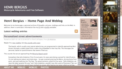
This is the latest iteration of my home on the web. I’ve had a website since sometime in 1994, and under this same “iki” address since 2001. This latest design was actually made in spring 2006 after our US trip, but has been waiting in mothballs for the right moment.
My website has an important communicative and archiving role for me. It serves in:
- Keeping my friends and family up-to-date on my whereabouts
- Archiving my personal life (in twitters, photos, blogs and locations) for my own use
- …and finally, providing a channel for communicating things happening in the Midgard and OpenPsa spaces
New features
The site now runs on latest and greatest versions of both Midgard and MidCOM. This upgrade does bring some features, but not much. I had actually implemented most of the new things already as custom scripts for the previous site version, which of course made upgrading more difficult. Now things like positioning, categorization, commenting and moblogging are standard features in the distribution.
Still, being a developer, I could not launch a new version of the site without bringing some new features on the table. These include:
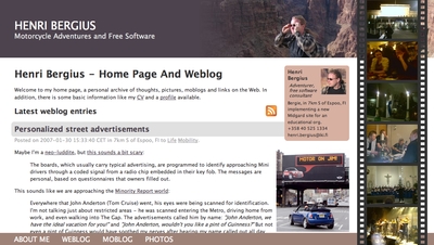
The film strip is used to display either pictures from the week a page was written, or 10 latest pictures
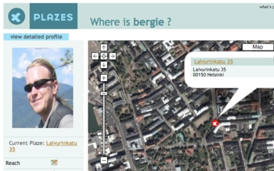
Positioning is now powered by real, mostly Plazes-powered coordinates and a real database of cities and airports. This brings with itself some Microformat and GeoRSS goodness, like live maps

My contact information is available as a machine-readable hCard on most pages
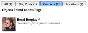
The contact information card also has a simple informal status message powered by Twitter
Also, less visually:
-
The same Twitter status message and my current position are also available as a Microsummary for Firefox 2.x, which in turn updates my instant messaging status
-
I’m providing OpenID information on the site, enabling
http://bergie.iki.fi/to be my identity when logging into multiple services
All of this happens in the realization that my site is used less and less in the traditional way of browsing to it, and more and more by different content aggregators like RSS readers, Planet aggregators and Microformat readers.
The design
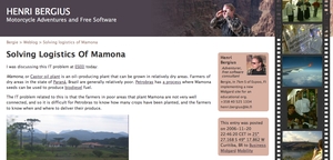
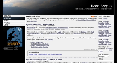
So, while the design is seen by fewer people than earlier, I wanted to switch to a lighter design from the previous very black layout. While the great majority of my readers access the content using the RSS feeds, the white background should still make the site more accessible to the rest.
The supporting colors of the site are natural hues taken from the scenery of the Colorado River canyon. This should fit well with the numbers of travel pictures I’m publishing.
There is also my picture on the pages. I realised that it is actually nice to see who the author is, and so switched away from the anonymous picture of Caucasus Mountains into a picture of the Grand Canyon with me in it.
The old design:
The new design:
Midgard template
I’m maintaining the Midgard template for this site in the company SVN repository. I can however make a PEAR package of it available for those interested.
Performance
Unfortunately I’m still being hosted for free on Torben’s old server that is soon to be decommissioned. This means that the site runs really, really slowly, and because it is a chroot environment I can’t even do caching via Squid.
This part will probably improve when I move the site to FTC’s Midgard hosting facilities. I’m also considering other options, like a cheap virtual server from Louhi.net.
