Initial look at MeeGo Netbook, a minimalistic computer interface

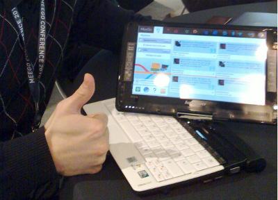
This week in MeeGo Conference all attendees received Lenovo S10-3t IdeaPad convertible netbook/tablet computers from Intel and Nokia. For many of us this was the first time we're actually using MeeGo on a device, and so I thought to post some notes on how it feels.

IdeaPad hardware
The IdeaPad looks and feels like a typical netbook: cheap plastic construction, big protruding battery, small trackpad and screen. However, it suddenly becomes quite interesting when you swivel the screen around, making it a tablet computer with a nicely sized touchscreen.
The whole package is quite much heavier than my current MacBook Air, but that is a price you pay for almost eight hour battery life. I wish a PC manufacturer started making as clean hardware as Apple does. A Nokia Booklet with MeeGo would come close.
All the normal stuff like WiFi (mine had Atheros), display-out and touchscreen work. For some reason trackpad buttons don't, and there is a mystery SIM card slot under the battery that needs a bit more investigation. Integrated 3G would be sweet!
MeeGo Netbook
When we got the netbooks in the conference there were two options for the install: fully free software, or one with proprietary WiFi drivers. Both images were development snapshots of MeeGo Netbook 1.1, a descendant of Intel's Moblin desktop. The system boots very quickly, and generally feels very responsive, though at times the bundled Chromium browser can make the whole system slow.
Getting the netbook set up was reasonably straightforward. Different areas of the MeeGo toolbar had integrated functionality for various services, with setup wizards for connecting to your accounts on them. In minutes I had my work calendar on the system, was connected to the IM networks I use, and had tweets appearing on the "MyZone" desktop.
Having all this cloud integration in place means the IdeaPad can quite easily serve in its intended "conference laptop" purpose - I don't need to do anything special to copy my data to the device, just connect it to various services.
IdeaPad as a tablet
Out of the box MeeGo Netbook doesn't deal with the tablet mode of the IdeaPad too well. Touchscreen works but generally applications are clumsy to use with it, and there is no on-screen keyboard. This can be fixed by installing a Chrome kinetic scrolling extension and grabbing the on-screen keyboard from the MeeGo Handheld repositories.
I've also heard reports that the IdeaPad would be able to run the full Handheld UX. But probably it is better to wait and see what kind of touch elements appear once the hackers who got their netbooks in the conference have time to play with them more. The MeeGo Forum has a thread discussing IdeaPad improvements.
Just how MeeGo is this?
The Netbook user interface comes from the Moblin project, and so builds on top of the GNOME stack, and ships mostly with applications coming from that desktop, even though MeeGo's official architecture designates Qt as the toolkit to use. It may be that at some point the Netbook user interface will get rewritten, but the more important thing to developers is that apart from default applications the MeeGo Netbook appears to be a pure MeeGo system: it uses MeeGo repositories, and all the services like Telepathy, GeoClue and Tracker are there.
This means that you can easily start developing and experimenting with MeeGo application development on this machine. The Community Applications system, including PPAs on the community OBS are being set up to help this, and there was some discussion on how to run Qt Creator on it. For now Git, Gedit and Python are enough for me.
Computer minimalism
I've written earlier about unitasking and the importance of having a computer environment that helps maintaining focus and getting things done. In this particular branch of computer minimalism the idea is that generally you should be doing just one thing at a time, with minimal distraction.
The MeeGo Zones paradigm does this reasonably well. In a normal usage situation there is nothing else on the screen than the application you're working on. The applications themselves can be organized between multiple zones, so you can cluster things based on working context.
MeeGo's toolbar autohides to the top and can be invoked by either moving the mouse there, or by pressing the Windows key. There you can quickly access areas of current information, like calendar events, TODOs, instant messages and tweets. When you've done handling those just let the toolbar slide away and you're back in your application. Information access, with minimal hassle.
Wrapping up
This initial look at MeeGo makes me a bit torn. On the other hand, I love the minimalistic interface paradigm, and the UI feels fast and smooth, but also lots of necessary software is missing and many parts feel unpolished. But still this isn't bad for a new OS that has been around for only about eight months. The hardware itself isn't too great, but probably the best current option for a cheap tablet/netbook convertible.
For now I plan to keep MeeGo Netbook on the machine. It won't be my work computer, but instead a travel and conference machine for quick hacking and browsing while on the road. I'll keep monitoring the relevant conversations to see how things improve, and will also try to write some improvements myself. The first step, though, is to report the bunch of bugs we've found so far.

