GNOME3 on Ubuntu Natty: the first impressions

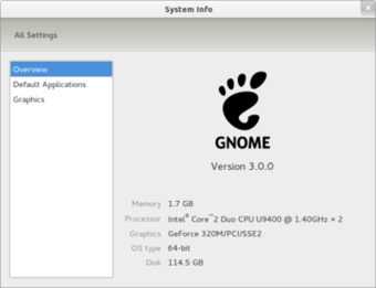
So, GNOME3 was released last week. I was then away in Saarbrucken, working on some linked data stuff, and so didn't have the courage to upgrade. But today I took the leap and installed both Ubuntu Natty beta and GNOME3 from the PPA. Now my 11" MacBook Air finally has the setup I originally intended for it.

As Ars Technica says, GNOME3 feels very solid for a first release. Some first impressions:
- Window management by dragging them to the edges is very handy
- Notifications allow me to focus on the things I'm doing at the moment, but still allow for easy conversations when I want them
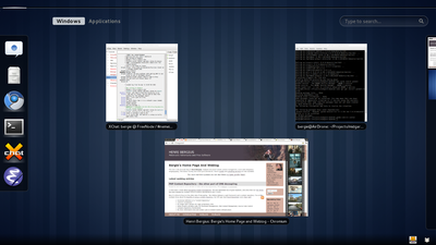
- Finding, launching and managing applications is easy. Apple key -> type some characters -> enter starts an application
- Wake-up from suspend and acquiring wireless are very snappy, though I guess this is mostly thanks to Natty and not the desktop
- The monochrome top bar is beautiful and has the necessary functionalities. I don't really miss the panel applets
- In general the desktop stays out of the way and lets me focus on what I'm working on
Then the weird stuff:
- The window decorations are humongous, especially as they have very little use in the window management paradigm. This really hurts the usable vertical space
- I really miss the global menus from Unity. Though with modern applications I might be even happier with no menus at all
- The system font looks a bit squished, but I guess that is because of my X settings
- I haven't figured out how to remove the unnecessary accessibility menu from the top bar
Anyway, great work from the team! I hope the annoyances can be fixed in due course, and I'm looking very much forward to hacking with Midgard and the JavaScript-based desktop.


