The uncanny valley of free desktops


Discussing Google's yet-vaporware Chrome OS, Daring Fireball said:
Early versions of Gnome and KDE were pretty much just clones of the Microsoft Windows UI. They’ve diverged since then, and I’d say Ubuntu’s default Gnome desktop is in most ways better from a design and usability standpoint than Windows Vista. But it’s still fundamentally a clone of Windows — menu bars within the window, minimize/maximize/close buttons at the top right of the window, the ugly single-character underlines in menu and button names. At a glance it looks like Windows with a different theme. The idea being that if you want Windows users to switch to Gnome or KDE, you’ve got to make it feel familiar. But that’s not how you get people to switch to a new product. People won’t switch to something that’s just a little bit better than what they’re used to. People switch when they see something that is way better, holy shit better, wow, this is like ten times better.
So I think Gnome and KDE are stuck with a problem similar to the uncanny valley. By establishing a conceptual framework that mimicks Windows, they can never really be that much different than Windows, and if they’re not that much different, they can never be that much better. If you want to make something a lot better, you’ve got to make something a lot different.
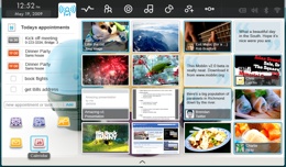
This is a good point to consider as GNOME moves towards 3.0 with the promising GNOME shell. KDE's Plasma has taken some steps also, but really, the examples we should look at here are Moblin 2.0 and the Sugar desktop. Both of them have largely discarded the traditional "Windows model" in favor of more contextual and information-oriented user interfaces.