Preparing for OpenPSA usability day
Tomorrow has been marked as the Beautiful OpenPSA Day in our corporate group calendar. The idea is to gather the whole team together to fix OpenPSA usability and eye candy issues. The date was set down when we decided to move Midgard CMS closer to the GNOME desktop usability-wise in an effort known as Project GNOMEgard.
Here are some ideas on what we should get started tomorrow:
- Usability
- Migrating forms to more accessible model using XHTML labels and fieldsets
- This will be a long road. The login screen and some individual screens now implement this
- Implementing access keys for switching between different tabs in OpenPSA applications
- Access keys in top menu are:
- 1: My summary
- 2: Calendar
- 3: Sales or Contacts
- 4: Projects
- 5: Documents
- 6: Personnel
- 7: Reports
- 8: Support
- 9: Email
- 0: Logout
- Implementing as much as GNOME Human Interface Guidelines as is practical
- Eye candy
- Switching Documents to use GNOME document icons
- Adding GNOME stock icons to buttons where appropriate
- Selecting identifier icons for several different resource types in OpenPSA
- Person

- Company (or department)

- Document (attachment)

- Event (calendar reservation)

- Project
- Task (or TODO item)

- Using GNOME palette for the default UI colors
I'll update this document as we go. If you have any additional items, please let me know.
The icons above are deep linked from their authors' sites. I know this is the wrong approach but I'm in a bit of haste. Sorry.
Updated 2004-12-15 14:35: There have been quite many CSS and API changes today, including a complete overhaul of the UI colors to GNOME palette and introduction of the openpsa_icon() interface for easily using icons from library in the applications.
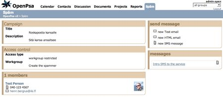
Before:

After:

This is a good start, but getting OpenPSA to the GNOME level of usability will still be a long road.
